
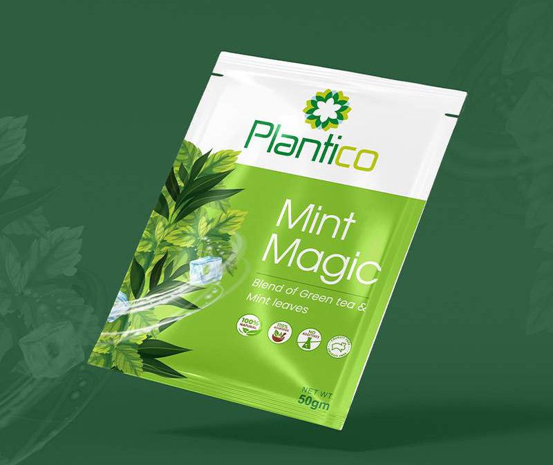
Most logos are approved on a big screen, zoomed in, on a white background. Then they spend the rest of their life at 2 cm wide — on a pouch, a WhatsApp display picture, the corner of a GST bill. That is where a weak logo falls apart.
Before we hand over any brand logo, we run it through a few simple checks. None of them need software.
1. The thumb test
Print the logo at the size of your thumbnail. Can you still read the name? Can you still tell what the symbol is? If the icon turns into a smudge, it needs fewer details, not more.
2. One colour only
Your logo will be printed in one colour more often than you think — on a rubber stamp, an embossed carton, a laser-cut sign. If it only works with its gradient, it doesn’t really work.
3. On a busy background
Put it on a product photo, on a shop shutter, on a kraft paper bag. On the Plantico pouch the mark sits on top of green leaves, so that is exactly where it has to be tested — not on a clean white artboard.
4. Next to your competitors
Line it up with five brands from the same shelf. If it blends in, the shape or the colour needs to change. Standing out is the whole job.
5. Say it out loud
Can a customer describe your logo over the phone? “The green leaf with the flower” is memorable. “The abstract swoosh” is not.
A good logo is not the one that looks best on the presentation slide. It is the one that still works when nobody is looking after it.

Leave a Reply