
A typo on a website takes a minute to fix. A typo on packaging means ten thousand pouches in the bin. That is why the last step of every packaging project at our studio is slow and a little boring — on purpose.
Here is the checklist we go through with every client before we send the final artwork to the printer.
1. Does it read from two metres away?
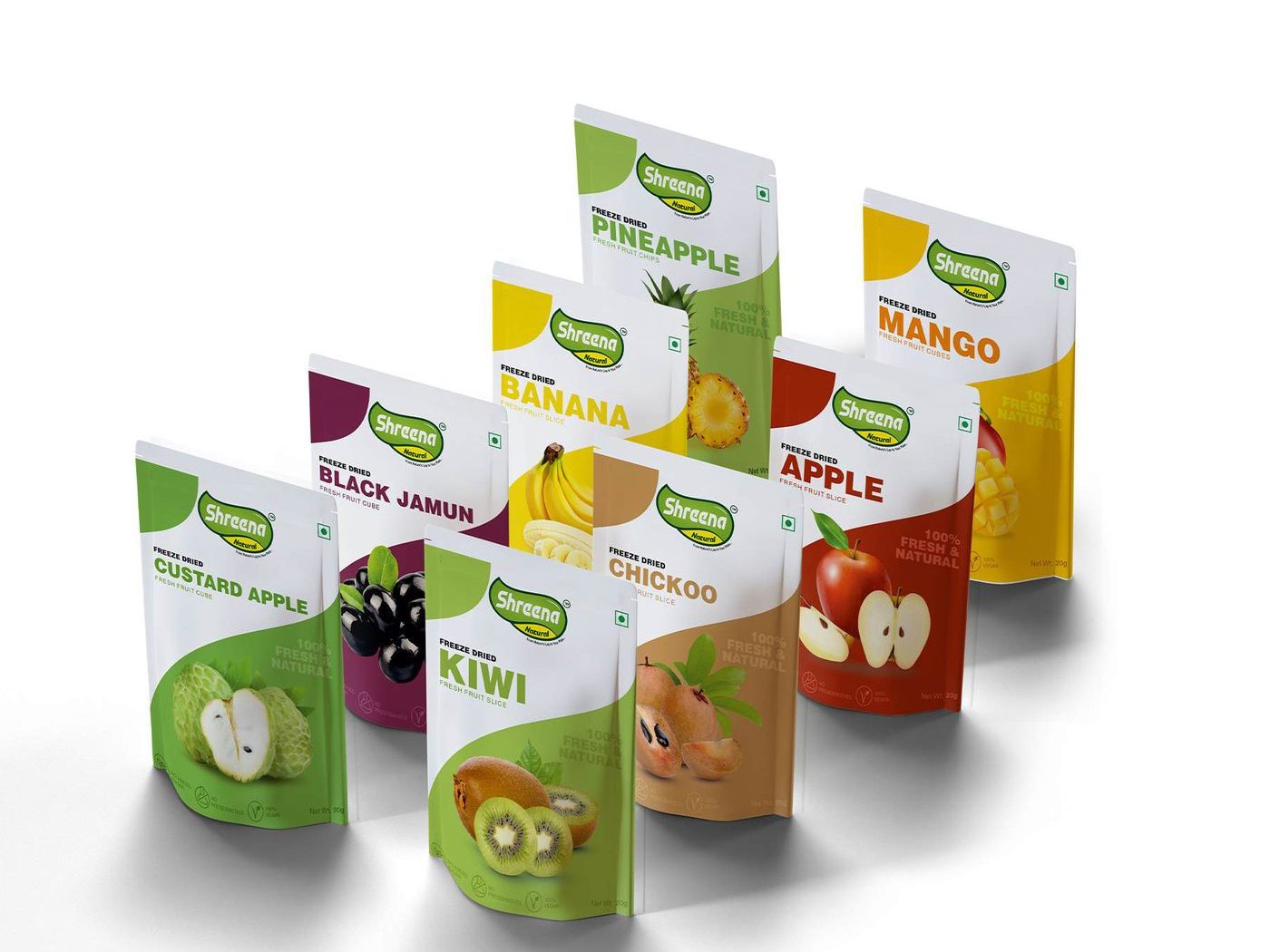
On a shelf, people see the front of the pack for about two seconds. The product name and the flavour need to be clear from a distance. When we designed the Shreena Natural freeze-dried range, each fruit got its own colour so that a customer could find “mango” or “kiwi” without reading anything.
2. Mandatory text is complete
FSSAI number, net weight, MRP, best before, manufacturer address, veg mark, nutrition table. We keep a separate checklist for food, cosmetics and pharma because the rules are different.
3. The dieline is the printer’s, not ours
Always design on the dieline your printer sends. Gussets, seals and folds eat into the artwork and a logo that sits too close to a seal will get cut.
4. Colours are proofed on the real material
Colours look different on metallised film, on kraft paper and on white board. We ask for a physical proof on the actual material before the full run.
5. The back of the pack is designed too
The back is where people decide to buy it again. A short brand story, a clear way to use the product and a QR code to your website do more than an empty white panel.
Packaging is the only ad your customer takes home. It is worth one more careful look.

Leave a Reply